AD Places and banners
General requirements
Don't use Flash for AD/Banners! Modern HTML5 allows to do more than Flash and works everywhere.
- To create a HTML5 banner use Google Web Designer or any other similar software.
- If the banner is to be shown on mobile devices, it is recommended to use a stub from a JPG image of appropriate size. This is due to limited performance of mobile devices (smoothness of animation on mobile devices will be significantly lower than on desktop versions).
- Additional requirements can be found in the description of a particular banner (see below).
Simple Smooth-animated banner
In Yoga Journal we stoped to use of GIF format due to obsolescence and the severe limitations of this format. Instead, we developed a modern version based on JS on the same principle of frame animation, but with a smooth transition and support for full-color JPG / PNG in frames.
The advantages of this format: image and animation quality, lower banner weight (up to 90% difference compared to GIF), support for smooth transitions on mobile devices. Because of the simplicity and efficiency, we recommend using this format.
This format is availaible to use in all types of banners, except Branding.
940×180 / Upper waist
- Platforms: phones, tablets, desktop
- Format: image (JPG, PNG); sequence of frames (JPG, PNG) for SMOOTH-animation; HTML5 banner
- Size (W×H): 940×180px (x2 for retina-screens)
- Total size limit: 600kb
- Site coverage: all pages
940х180 Example:

300×400 / Side banner
- Platforms: phones, tablets, desktop
- Format: image (JPG, PNG); sequence of frames (JPG, PNG) for SMOOTH-animation; HTML5 banner
- Size (W×H): 300×400px (x2 for retina-screens)
- Total size limit: 600kb
- Site coverage: all pages
Note
- Desktop/Tablet: shown on the main page as a 3rd post; on the article page - in the right column.
- Phones: shown on the main page as a 3rd post; on the article page inserts after 3rd paragraph.
300х400 Example:
| Desktop/Tablet | Mobile |
|---|---|
 |
 |
Bottom Line
- Platforms: phones only
- Format: image (JPG, PNG); sequence of frames (JPG, PNG) for SMOOTH-animation; HTML5 banner
- Size (W×H): 940×180px (x2 for retina-screens)
- Total size limit: 600kb
- Site coverage: all pages
Bottom Line Example:

Fullscreen
- Platforms: phones and tablets
- Format: image (JPG, PNG); sequence of frames (JPG, PNG) for SMOOTH-animation; HTML5 banner
- Size (W×H): 762×1142px (x2 for retina-screens)
- Total size limit: 600kb
- Site coverage: all pages
Note
- Official requirements
- Sources of one of the banner at Yoga Journal (download)
Fullscreen Example

П-Branding
- Platforms: tablets and desktop
- Format: JPG-image only
- Size (W×H): 2200×1400px
- Header height: 180px - maximum
- Total size limit: 600kb
- Site coverage: all pages
Note
- Due to the large size of the banner the use of animation is impossible.
- Take into account the different resolutions of users screens: on the tablets only the banner header is visible, while on the desktops header and side margins are visible
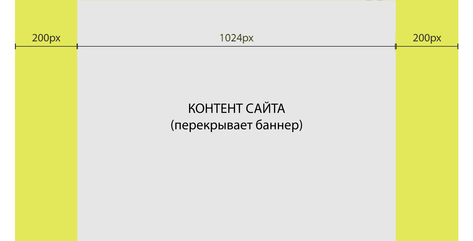
- The central part of the image will be covered by the site content (1024 px wide) - see the layout example below.
- Side margins - 200 pixels is the minimum “safe” size that will be visible on most desktops. More than 200 pixels will be visible only to visitors with larger monitors / resolutions. Usually, at these margins better to place background, not the banner content.
П-Branding example:

П-Branding layout:
Branding side-margins
- Platforms: desktops only
- Format: JPG-image only
- Size (W×H): 2200×1400px
- Total size limit: 600kb
- Site coverage: all pages
Note
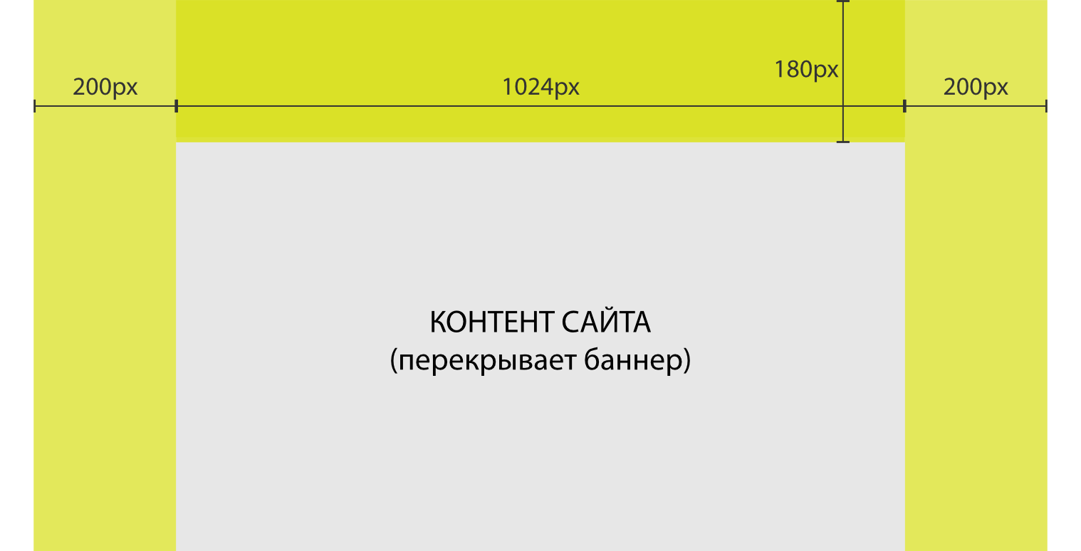
- General requirements as for П-branding, but without the top header. Therefore, it is shown only on desktops with a screen from 1200px wide and wider.
- Due to the large size of the banner the use of animation is impossible.
- Take into account the different resolutions of users screens: on the tablets only the banner header is visible, while on the desktops header and side margins are visible
- The central part of the image will be covered by the site content (1024 px wide) - see the layout example below.
- Side margins - 200 pixels is the minimum “safe” size that will be visible on most desktops. More than 200 pixels will be visible only to visitors with larger monitors / resolutions. Usually, at these margins better to place background, not the banner content.
Layout: